How to easily understand Flexbox CSS - (Part 1)

Hello, there 👋 I'm Alan!
I love teaching people how to code, and making coding tutorials, one of my big passions is transferring my web development/coding skills and knowledge on to people like you! 🔥
...I'm a 29-year-old Software Developer based in Belfast in Northern Ireland. My current full-time role is Frontend Development Lead where I lead and oversee all the frontend development for our new platform and framework, built in NextJS, React TailwindCSS bundled in a NX mono-repo. I am also the Mobile Team Lead where I develop apps for our company using the Ionic Framework and React javascript.
Throughout this blog, expect to see How to posts about coding on all aspects of HTML, CSS, Javascript (JS), ReactJS, NodeJS, PHP, and even the odd review of cool UI Frameworks or libraries that I've found.
🔔 Be sure to subscribe to my YouTube channel if you want to catch my quick, easy to follow coding tutorials! 🔔
In this mini-series, I will be taking you through how to use flexbox CSS, in a simple, easy to understand way. You can really empower your projects and websites with the use of flexbox CSS and reduce your lines of code drastically. I have also released a video-based tutorial series over on my YouTube so if you'd prefer a video, check that below! Ok... Let's get into it.
What is Flexbox CSS?
Flexbox CSS is a one dimensional layout model/method used for laying out items (HTML elements) in a row or column fashion (horizontal or vertical).
Why Flexbox CSS?
Long gone are the days of using float and position in CSS to create layouts and responsive layouts. Utilising flexbox allows you to create fully responsive, mobile first layouts without needing to write lots of different media queries.
Display
The most important CSS property in flexbox is the display property. This is how we define a "flexbox container". Familiar display properties include block, inline, inline-block etc etc. Flex is no different, it can be defined like this:
.container {

    display: flex;
}
Container
<div class="container">
    <div class="item"></div>
    <div class="item"></div>
    <div class="item"></div>
</div>
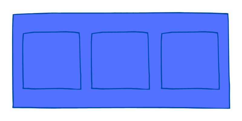
Our flex container is typically a block level element, usually like a div for example. Refer to the below image; I have defined a flex container and inside my flex container, I have three more divs.
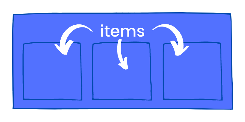
Items
These are called flex items. Each child inside a flex container is referred to as an "item". You can style these individually again, using flexbox CSS if wanted and we'll get into the specifics of this in the next part.
Flex Direction
.container {

    display: flex;
    flex-direction:
}
The next important CSS property in terms of flexbox is the flex-direction property. This allows you to specify which direction you want to place the items inside the flex container. There are four values which can be used for the flex-direction property, either in a row or a column (e.g. horizontally or vertically).
Row
.container {

    display: flex;
    flex-direction: row;
}
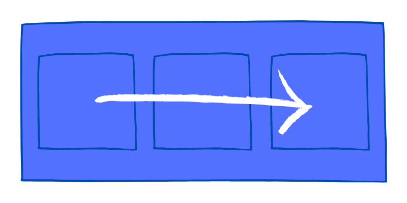
By default, a flex container will automatically have the flex direction of row. Items inside a row direction flex container will be displayed left to right (LTR), your first item will be the first placed element on the display.
Row Reverse
.container {

    display: flex;
    flex-direction: row-reverse;
}
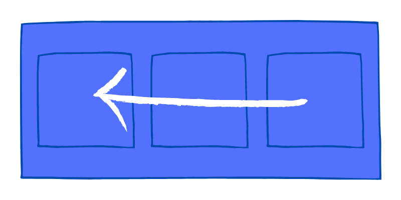
The row-reverse value for flex-direction is similar to the row value, however the items inside a row-reverse direction flex container will be displayed right to left (RTL), so your first item will now become the last for example.
Column and Column Reverse
.container {

    display: flex;
    flex-direction: column | column-reverse;
}
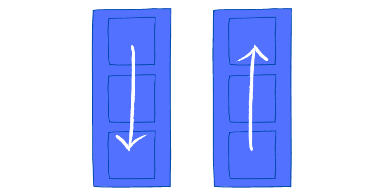
The next type of flex-direction you can specify is in the vertical axis in the form of columns. First of all with the column value, similar to the row value but placed top to bottom (TTB). Alternatively you can use the column-reverse value which again, is similar to row-reverse but displayed bottom to top (BTT).
Hope you enjoyed part 1 of my easy to understand flexbox CSS tutorial. It really is that simple to get started using it. In the next part we'll look at some more specific properties we can use to justify-content to space out flex items inside our flex containers!
Please leave a comment and a reaction to this post if you enjoyed it! Also, I have a YouTube channel where I'm posting lots of coding tutorials, tips, tricks, reviews and more, would love to see you there:
See you in the next part!


